Final Creative Project - Lewis Green
Planning & Production
FCP Proposal


FCP Pitch


use


FCP Plan

Begin character construction and design using skills from previous workshops.
Start sketching using the sketchbook then transfer from Photoshop to Illustrator.
Develop skills further in Illustrator, learning new tools and methods.
Create a Moodboard and follow workshops involving Illustrator for better knowledge
Illustrator and youtube videos for tutorials. Adobe tutorials too.
Illustrator and Photoshop for workshop. Moodboard requires scissors and glue.
Continue character construction, begin work on Lion, experiment with more tools
Create a logo and a background. Bring character and lion together. Finish poster.
Continue in Photoshop, create a brush workshop, blending modes and blur.
Move over to Illustrator, creating a logo workshop, finish by end of the week.
Gantt charts are used to keep track of progress for my project. This gantt chart is referred to as my 'FCP Plan', something that I find to be a big help because I used gantt charts in my last two projects to help me keep up to date with work and to make sure I am not falling behind. I will be using this FCP plan for the same thing, it helps me note down what I need to prepare for a certain week and what resources I will need and learn. I've also noted what weeks are production so I know when I have to be ready to begin my FCP design. The weeks are getting closer and closer but I feel like I am ready to work and show my tutors and peers everything I have learned since September and what kind of work I am capable of doing in the future.
Mood Board

Mood boards are one of my favourite things to create when working on a project. It really helps me express my ideas and if you are struggling to understand my FCP, all you have to do is look at my mood board. Since September, I have made mood boards from printed pictures with glue to then digital on PowerPoint. I can't decide which I prefer but for this project, I have made mine with the basic printed pictures from google and glue. I feel like I have more creativity when it's being put together by hand because I can always add something or write notes down with my pen. From what I have on my mood board now though, I feel like it's a good start and a simple understanding of what my idea is. I have used three shades of blue because that's the colour used a lot in my FCP from my superhero's suit to my lion's fire. I also included Marvel Comics because that is the art style I am along with a superhero like Storm as inspiration. When it comes to creating scripts and storyboards, I don't think that they are required for this project because I am not animating, I am making a still image. I am however, going to be using scamps to express further ideas.
Scamps

Scamps were never a thought that came to mind for this project, in fact, I hadn't really heard about them until this week but I thought it would be another great way to express ideas. The whole point of scamping is to free your mind from any ideas, this also includes not hiding away any ideas in your sketchbook or digitally on a PowerPoint. These ideas need to be seen and easily accessible so that when I ever need inspiration, I can quickly find it. I created scamps with sticky notes, using my wall as a blank canvas so that I could have my ideas out in the open. We have something similar at college, a wall full of past images from previous projects. I now have my own wall in my bedroom which I find helpful so that when I work from home, I am able to still keep the inspiration flowing and allow myself to not lose focus on what I want my FCP outcome to be. I would definitely use scamping in the future, I found the process very helpful.
121 Tracking

After having a 121 with my tutor, I have now been given a tracking sheet to work towards now that production has begun. I am going to research more about my comic and the ideas I got to create a lion. It's also been pointed out to me that I should add where the inspiration for my hero comes from. During production, I hope to also add more scamps to keep me creative and in the work mindset when I am home. I also need to constantly be taking screenshots of my production to show where I started and where I finished. Practical Skills could also use an update as I feel that more tools need experimenting with if i'm looking for the best result, I'm experimenting right now with a tool using Photoshop so that is something new to add. As for weekly evaluations, I never fail to update where I am and how I'm feeling as I also want to include what my thought process is in that certain week. Not only have I been giving a tracking sheet but I have also set myself targets during production to complete by the end of my FCP.
Constructing The Characters


Making a start on my production, I have started to draw my final images for what I want my production result to look like. The amount of character construction poses I have drawn as well as lions sitting and lying down, I can proudly agree with myself that these two images are the images that I will be developing further going into this week and the next. I'm using Photoshop to begin with so I can clean up my images and make them clear for me to work with. I'm going to be using a Wacom to redraw the outlines in a more thicker black. I am still using videos to help me with my skills because creating a character with nothing to start from can be a struggle for me. I have already explained in previous paragraphs about how you come about to clean up an image drawn in a sketchbook. I simply only mess around with the brightness and contrast so that the background goes from a dark to white. These images are now ready to be transferred into Illustrator if I'd like but I still want to add more before that happens.


Still working in Photoshop, I had now started to trace over my images using the brush tool. I wanted to outline my images so that I knew what I was able change and where I want to include detail when it comes to shading. Looking at the outlined images, they are a little scruffy and some lines aren't as straight as I'd have liked but I wasn't looking for a perfect outcome. This is not the final outcome I will be using, the images you see could be completely different when colour and detail has been added and I actually add facial features to my hero like I did with my Lion. My next task I am giving myself is to work further into my hero's outfit. There is no need to over complicate things after all I want to use the Marvel Comic art style.


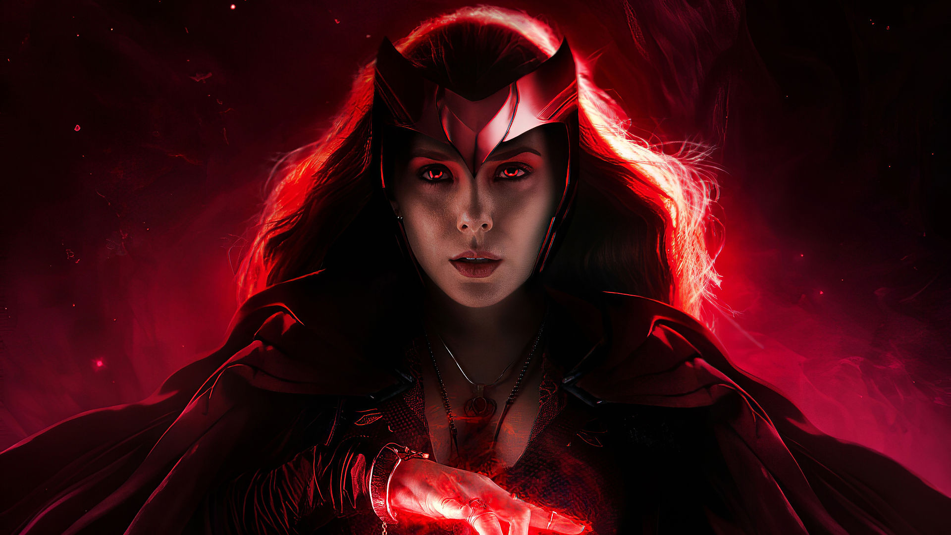
Constructing Blue Lightning

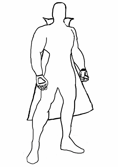
Still in Photoshop, I changed the pose of my hero to make him stand out and look more brave and ready for a fight. As you can see on the second image, I have added a cape to my character and fingerless gloves. I'm going to wait until my character has facial features before I add any hair, this is so I can measure the length of the hairline and how big the facial features have to be. The reason for changing the pose is because I felt like the original one I chose to begin with was a little stiff, there was no movement and position, preventing the costume from fitting with the hero more naturally.


Now that the costume was finalised, it was time to add colour to my character. I've known right from the beginning that I wanted him to be wearing blue attire and I've not held back with the comic art style on how most of the Marvel heroes are wearing spandex and the colours are crazy and have that natural superhero vibe. I think I have succeeded in putting the costume together, I failed to add facial features as that is an area I struggle with the most, I will come back later on in the project to add the features.
Constructing The White Lion


To 100% complete my poster, I need to make sure I capture the right pose and face expression of my Lion. As you can see from the images above, my Lion is going to have a blue fire mane with blue glowing eyes. I personally enjoy this look a lot, getting ideas from The Golden Compass and His Dark Materials. I started with a side view to show you a rough idea of what he's going to look like, remember it's not finalised so it can always change. I'm aiming to have my poster be of both heroes, my Lion will either be roaring beside my hero or being ridden by him in battle. To clarify, there names are Blue Lightning and The White Lion.
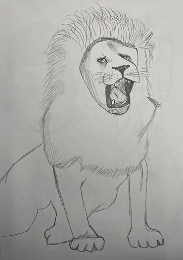

Finalising the sketch of my lion, I do what I always do when transferring a sketch onto my computer and that is changing the brightness and contrast to clean up the image. When the image was cleaned, I traced the outline in a thicker black using the brush tool, making it easier to see and easier to colour in. I had a lot of fun redrawing my lion, I had extra space to work with so I changed his legs completely. It was pointed out to me that if you cut off your character, you can't move them around very much on the poster so because of that I gave him legs. I'm happy with the outcome, giving my lion as much detail as I possibly can before bringing in colour. I think once colour is added and his fire blue mane and glowing eyes are given to him, he'll look like a super lion in no time.


Zaragon, The White Lion, is now finished. Looking at the images above, you can clearly see the progress of colour used on him, from his white fur to his fire tail to his glowing eyes and his fire mane. I really think the outcome was worth it, especially since I learnt about blending modes when creating the fire effect. You can find out more about the outer glow effect I used on my practical skills page but all it did was make him look as cool as I imagined him. There is room for improvement, I can experiment with realistic hair-like brushes to really capture the strands of a natural lion's mane but for now, I am happy with what I produced.
121 Tracking

After having a second 121 with my tutor, I now have some reassurance that I am working at the right pace and the work that I am producing for production is good enough for me to be given a green on my tracking. Just because I have a green doesn't mean I should slow down and relax a little because there is still so many things needing to be created and with only a week left on production, I have no time to stop and think about what I could change or add. Research is still amber but I understand that more research is needed and I still feel like I can add a lot more to my page in terms of what inspires me and gives me ideas that relate to the comic poster I am trying to recreate with my own hero.
Creating The Logo


This logo will be placed in the bottom left corner of my poster. Just like the Marvel comics, there is always a logo or a watermark as a way of branding the work you design as proof that it's actually you who created what the viewers will be looking at. My logo is simple, consisting of my initials 'L' and 'G' put together. I think it looks cool, especially when there is a different colour for each letter. I did more than one design so I have a selection to work with when putting this logo onto my poster. So far I am attracted more to the dark blue and grey because I think it suits the aesthetic that I've gone for but then on the other hand, it could be a little too dark as the background for my poster will be dark too. I created this logo on Illustrator, following a workshop on how to design your own logo. Using the pen tool, I managed to make simple boxes. I normally struggle with the pen tool but I found my experience creating this logo easier than previous attempts with the tool.


Coming back to creating logos, it was pointed out to me that using the shape tool would be a big help in getting straighter lines. I found this suggestion really helpful and looking back, I am confused as to why I didn't think about this from the start, I think it was because I created this logo originally using the pen tool as that was what was used in the workshop I followed. My peer was actually the one to point out that the rectangle shape can come in handy, this made me trace over the original logo with rectangles, giving me a more neater outcome along with a better way to display my colours. In my opinion, it was totally worth going back and redoing this logo as I think it looks so much better, modern and up to date.
Creating The Title

Creating the title for my poster was really fun. No longer on Photoshop, I have now begun FCP production using Illustrator. The only tool I used was the type tool and how I was able to get such a powerful electric looking font was by accessing the creative cloud fonts. This font is called 'Banshee' and I found this font the most appealing to me as it gave off such a comic book feel, especially with the characters I have created, it suited their personality the best and the colours I chose were a mixtures of different blues as blue is an occuring colour and theme in my poster. Personally, I am happy with the title and cannot wait to see what it will look like once everything is put together to create the final FCP outcome.


Creating The Background


Backgrounds were a lot of fun to create and I personally have had a lot of fun designing them. Three has always been my limit on designs so that's how many I set myself to make. Out of the three backgrounds that I made using Illustrator, my favourite would have the be the closest one on the right. With help that my tutor sent me, I designed this background looking at inspirational stock images of stars in a midnight sky. The northern lights also inspired me for this background. As for the other two, I think they could be a little better detail-wise as the second one lacks depth and the first lacking realism, I enjoyed producing them but when it comes down to picking one, they will not be apart of the selection. Now that my background, my title and my logo are done, I can now combine them with my characters from Photoshop. My production has all been leading to this part so it's time to finalise the product and make changes to anything if necessary.
Feedback From Peers


Feedback is extremely helpful, especially when it comes down to production on my FCP because it allows me to have a better understanding if I am doing my work correctly, if I'm on track and if I need any improvements. Whether it's down to writing enough or explaining my ideas and the process of production along with including screenshots, accomplishing my goals and targets that I set myself. Feedback is also nice to hear in general because someone is viewing your work and is happy with the standard you are producing. I have also given feedback to my peers, allowing them to know what the highs and lows of their production is. What they can improve on and what they have already excelled at. Taking in these feedback notes, I have already begun work on suggestions I have been given as it benefits me and my FCP outcome.
121 Tracking
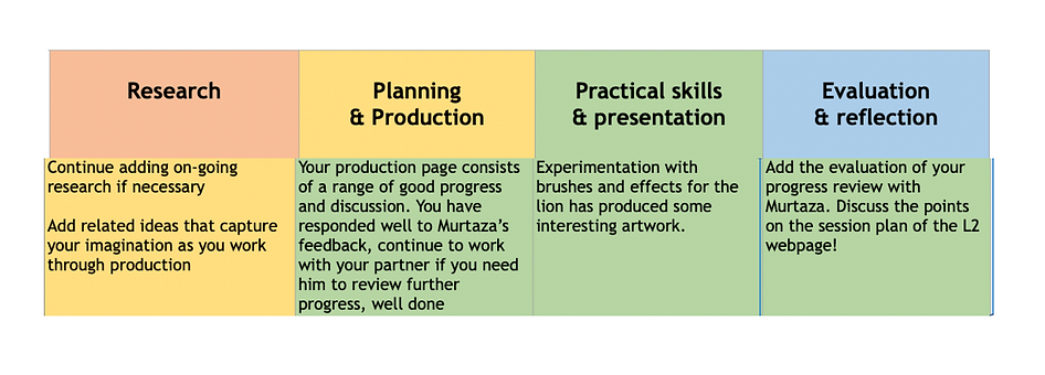
After having a third 121 with my tutor, It has helped me with my intentions on what I want my FCP outcome to be as I am so close to finishing my project with only one week in production left. In order to complete this poster, I need to experiment with more brushes to really capture the fire detail I am struggling so hard to make for my lion. I know what I need to do and the only thing that is delaying my FCP is myself by not following the steps on the tracking sheet. This week and the next will be the week I finalise everything so that presentation is prepared when it comes to showing the class my work. As for research, I am going to be adding more to do with facial features as that is a challenge I need to focus on more next week. This week, feedback has been really helpful and the more I get, the more I am going to succeed for my FCP.
Putting The Poster Together


I have finally approached the final week in production, meaning that if I was following my plan correctly, I should be finished with my poster. I have every file from Illustrator and Photoshop and now it is time to bring all those files together into one Illustrator document. As you can see, I finally got the fire effect on my lion and I am very pleased with the outcome. As for my hero, I feel like I did the best I could with his hair and facial features. If you were to compare my starting designs to now, you will clearly see how far I have come and how my skills have development in the space of three months. My logo also changed thanks to a workshop I had on creating the perfect logo using minimal space. This will act as a watermark for my poster, stating that the work you see is clearly mine. From the title and the background, nothing changed. I feel like I did a good job with them back when they were first created. I've had a lot of fun these past few weeks working on production. From having a lack of imagination of what to produce and then creating something I can be proud of means a lot, not only my drawings but my written work too that has helped explain my ideas and thought process along the way. I'm excited for you to see my FCP poster.
121 Tracking

TARGETS
1)Construct Characters
2)Construct Hero and Costume
3)Construct Lion
4)Create Logo
5)Create Title
6)Create Background
7)Bring everything together for FCP poster
After having a fourth 121 with my tutor, my research has finally made it's way to the green section, letting me know that a good amount of research that I have done is satisfactory from those who view my website. Not only is that a big accomplishment but my targets throughout production have also been completed and I couldn't be more pleased. Of course, this is not a time to start going downhill with the level of work I am still putting into lessons, I am still given tasks as you can see to go back through my entire website to grammar and spell check my work which I will gladly do. I am also going to keep on top of my evaluation and reflection, letting you know my thought process throughout the final weeks and how I am feeling. As for my FCP, I have completed everything 100% and am giving myself time to reflect on where I started and where I ended up, making sure my goal back in March is the same as it is today.
FCP Poster

Back in March, I was given the choice to present anything for my Final Creative Project. This project started from home as classes were delivered via zoom. I created this website, clueless as to what my theme could be. I'm a huge fan on Marvel from the movies to the comics. I wanted to create my own hero in the style of a Marvel comic. Well, now we are in the end of May, my FCP is finished and in my opinion, I think I have delivered on what I said I wanted to do two months back. From my creative treatment to my plan, I have followed every step, every week, keeping up with the production I was doing, creating everything you see in the poster above from the characters, the title, the logo and the background. Now I know that there are things that can be improved and I see mistakes I made back then but this is development looking back at the previous projects to where I am now and this project has really allowed me to show my graphic design side to the course as that is what I will be going into moving forward in September. Production may be finished but I am now working on presentation and making sure my evaluations and reflection are up to date along with checking my spelling and grammar. Overall, I have enjoyed putting this project together and cannot wait to see what grade I get and what awaits me in September.
This poster was made in Illustrator, I brought both my hero and my lion in from photoshop and placed them standing side by side as they are the main focus for this poster. My logo goes in the corner to show everyone that this production was made by me, it's also good to sign your work to make sure nothing gets stolen by anyone else. My title blended in a little too much with the background, hence as to why I gave a little background behind the title to make it stand out more, changing the stroke to white as blue on blue did not go well with each other. When it comes to presenting, I am ready for feedback and what my tutors and peers will think. I also can't wait to see what they have all done also. This project has been really fun.