
Final Creative Project - Lewis Green
Practical Skills
Creating A Top Trumps Card


Top Trumps are a well known part of my childhood and probably for everyone else my age. I used to play top trumps with my nephew growing up, we'd always use the Disney themed pack but the possibilities for other themes were endless. The fact that I got to create my own version of a top trumps card it really cool because it brought back memories from when I was little. I used the animal theme to create my own card as the character I wanted to put on my card was a lion. I used this workshop to also help me develop my character's personality and his origin by giving him a bio and his own little fun fact. His name is 'Zaragon' also known as 'The White Lion'. He is the pet of my superhero 'Blue Lightning' a member of the X-Men, brother of Aurora Monroe who is referred to as 'Storm' in the X-Men comics and adaptations but I shall dive into my hero's past another time.
Using my sketch book, I first drew out my lion using a sharpie so that when I brought him into Photoshop to clean up, the outline would appear clear and editable, making things easier for me to work with in Illustrator. You can see from the two images above what my drawing looked like before and after it was digital. I personally love the after look because it's bright and clear and doesn't have the dark edges from shadows and shades. Once my cleaned up lion was in illustrator, I first had to create the card design. You can see the image below where I got my inspiration from. I decided to make my card blue to go with the sky and lightning theme and add a star around my fun fact so that is stands out. I gave 'Zaragon' god mode skills because he is a character that you do not want to mess with. I enjoyed this workshop and it definitely helped me remember the tools for Illustrator because I didn't really use the software in my last project. This project however, I feel like Illustrator will become my best friend moving onto Graphic Design.


Customising Fonts

Fonts are what brings the production to life in my opinion, it's all about giving your work a personality and a font can do that perfectly. Not that I haven't mentioned it 100 times already but take 'Marvel' for example, notice in all of their covers for movies and even the comic books, they have their own font and the font is named after the movie or comic etc. Today in Illustrator, I got to experiment with fonts, I chose one from Dafont that was listed under the 'Superhero' category and downloaded it so that it would become available to use in any software, I could even use it in Word or PowerPoint. With this font, I was able to change the colour, size and stroke so that the outline of the word appeared thicker than the inside. Moving on further into customisation, I created an outline that allowed me to move and change any letter I wanted. I decided the make every starting letter of 'The White Lion' bigger than the rest so it really stood out. That's one thing I want to make sure I do correctly for my FCP and it is to make my design stands out. Above is the outcome when it was finished, overall I was happy with what I had produced and I had learned a new skill.
Experimenting With The Pencil Tool
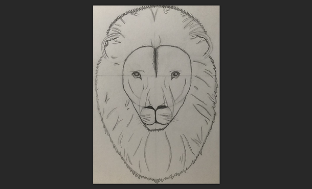


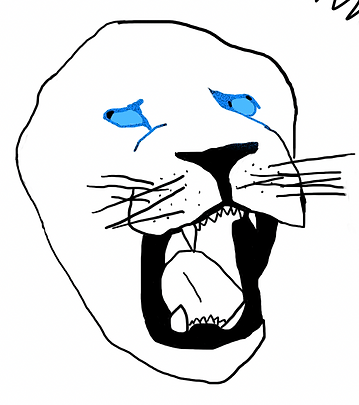
Trying something new, I decided to experiment with a tool I had never used before, the pencil tool. First things first however, I had to bring up both Photoshop and Illustrator to carry out my work. Why both? Using the technique I learnt in a previous workshop with top trumps cards, I had to begin in Photoshop where I could import a previous image I had drawn in my sketchbook. It was a face of a lion, something I thought I could really work with and succeed in creating a digital copy. When the image was imported, I clicked on 'Image' at the top of my screen, went to 'Adjustments' where I could find the 'Brightness/Contrast' option. This allowed me the clean my image and remove the dark areas to make my lion as clear and bright as possible so that when I was in Illustrator, I would find the image easy to redraw.
In my opinion, I had no struggle with the pencil tool. It was easy and simple to control, from tracing the mane to the ears and then the facial features to really bring my lion to life and give him a dark outline so that if I were to ever add colour, I could. This was of course all made on a new layer too so that I could move the outline if I made a mistake. I was drawing using a mouse but I do have access to a wacom, when my production begins I believe my Wacom will be a big help to me at college and working from home. If you didn't have one for your project, I would recommend it, especially for those who have shaky hands. I was working from home creating this and I feel like I did a good job and could definitley expand this further and add more if I wanted.
Practicing With The Pen Tool
The pen tool is something that I struggle with despite it being so easy to use and draw. A minigame was recommended to us on a website. We were given different shapes to redraw using the hotkeys required to make curves and to be able to stop the line from expanding. Now I did find this to be a big help, I do prefer to use the brush tool but the pen tool is a lot more neater and if you know what you're doing and where you're putting your lines, you can make a perfect looking image entirely made from lineart and that's something I wouldn't mind attempting for my poster when production starts.
Experimenting With Poster Design


Now that I am in the early stages of production, I thought it would be beneficial if I was to practice with pre-made posters from movies that have already been released. I worked with both 'Ferdinand' and 'Trolls' and placed every character and word you see in the images above. I had a lot of fun creating them both and it really gave me a better understanding of how I would design a poster, especially since the outcome for my FCP will be a 'Marvel Comic Poster' representing my two characters. Notice how there are more than one pose for a character. that is something that I can learn from and design my characters from different perspectives. It's nice to have a selection of poses to choose from instead of only drawing one and sticking with it throughout the entire project. I also notice how there is more than one background too so there are many scenarios you are able to create and place your characters in.
Experimenting With Blending Modes - The Outer Glow Effect


Blending modes had turned into a big help when it came to colouring in my lion. At first, they were just a simple bright blue colour but now, with help from using the outer glow, the eyes can be highlighted and radiate a bigger glow to give a realistic looking super lion that can shoot lasers from his eyes. Now this isn't the end of adding effects to my lion, there are so many other ways I can portray the glowing effect, using blurs and even adding my own brush. The brush will come in handy for the fur and the fire later on when I get to colouring in the rest. I completely forgot how useful blending modes can be so this has turned into a great help in making progress for my FCP.
Experimenting With The Blur Tool


Trying to capture the lion's blue fire mane, I experimented with the blur effect to really bring out the glow.
Now, previously I already used blending modes to highlight the eyes of my lion but there is nothing wrong with experimenting different ways. Personally, I prefer blending modes but this task was to still fun to carry out, especially because I got to also mess around with the saturation and work with more than one blur. As you can see from the images above, the radius was what allowed the blur to be changed. There was so many blur options to choose from but the one I found most useful was the 'Gaussian' blur, it was also recommended to me by my tutor.
Saturation Orange Eyes
Saturation Blue Eyes
Saturation Glowing Eyes


Gaussian Blur 50.0
Gaussian Blur 40.0
Gaussian Blur 12.0


Here are all the experiments I did using my lion, I changed the background from white to black so the glow could be easily shown, noting that when it comes to creating my background, I will have to use dark colours for the full glow effect. From the images above, you can notice the difference between the different blur radius. Notice how as the radius gets smaller, the glow of the lion's mouth begins to get brighter, telling me that when it comes to the FCP design, the radius has to be small but it was still fun playing around with a higher radius. All the saturation did was change the eye colour. The original was orange but I soon swapped it for blue and then I tried a lighter cyan colour than can also give a glow effect.
Experimenting With The Paint & Smudge Tool - Creating My Own Brush


I hadn't experimented with different brushes yet in this project so it was recommended to me by my tutor in help of getting a realistic looking brush for the hair and fire of my lion. I used the Photoshop workshop to create my brush, following the steps as shown in the images above. This was two tools used here, the paint tool and the smudge tool, I was familiar with both and had used them in the past. The paint tool allowed me to mess with the flow and opacity, looking at the second image you can see how some lines are lighter than the dark circles. The third images was me blending the shapes and lines together using the blend tool. Once that was finished, I could create a preset of this brush. I think in order to capture the hair strands, I would have to remake another brush but I had a lot of fun making this project and it has really helped me.